Dive into CSS Layout
Yanhong Wu
2015.12.04
Front-end Development
HTML
CSS
JavaScript
Content
Style
Logic
ascading tyle heets
C
S
S
<div>
  <h1>CSS</h1>
</div>
CSS
h1 {
  color: purple;
  font-size: 20px;
}

/**
selector {
  // description
  property1: value1;
  property2: value2;
}
**/
HTML
CSS
Result
ascading tyle heets
- Basic Properties
- Selector
C
S
S
- Box Model
- Position Scheme
- Others
-
- Block Formatting Context (BFC)
- Flexbox
Box Model
4 regions: content, padding, border, and margin
<div id="container">
  <div id="content">
    Content
  </div>
</div>
#container {
margin: 50px;
padding: 50px;
border: 50px solid lightblue;
}
#content {
color: black;
background: orange;
}margin
border
padding
Box Model
<div id="container">
  <div id="block1">
    Block1
  </div>
  <div id="block2">
    Block2
  </div>
</div>
#block1, #block2 {
margin: 20px auto;
height: 100px;
width: 200px;
}
#block1 {
background: blue;
}
#block2 {
background: orange;
padding: 20px;
border: 10px solid;
}Element width issue
Box Model
<div id="container">
  <div id="block1">
    Block1
  </div>
  <div id="block2">
    Block2
  </div>
</div>
#block1, #block2 {
margin: 20px auto;
height: 100px;
width: 200px;
}
#block1 {
box-sizing: border-box;
}
#block2 {
box-sizing: border-box;
padding: 20px;
border: 10px solid;
}box-sizing: border-box (CSS 3)
Position Scheme
-
- Static position
- Relative position
- Floats
- Absolute Position
- Absolute Position
- Fixed Position
- Normal Flow
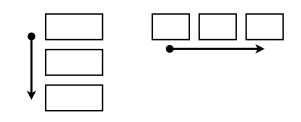
Normal Flow
- Display: block
- "weight/height" attribute is valid
- fill up parent container (if not assigned)
- layout: block formatting context
- Display: inline
- "weight/height" attribute is invalid
- actual width depends on the content
- layout: inline formatting context
-
Display: inline-box
- outside layout: inline formatting context
- inside layout: block formatting context
- Display: none, table, ...
- Layout: block formatting context
- boxes are laid out one after the other, vertically
- margin collapsing
- Layout: inline formatting context
- boxes are laid out one after the other, horizontally
- vertical "padding/margin" is invalid
Normal Flow
Display: block
Display: inline
Display: inline-block
span {
  height: 50px;
  display: block;
}
span {
height: 50px;
}span {
height: 50px;
display: inline-block
}Normal Flow
Layout: block formatting context
Layout: inline formatting context
#block1 {background: blue; margin: 20px;}
#block2 {background: orange; margin: 20px;}
#block3 {background: green; margin: 20px;}
#block1 {... display: inline;}
#block2 {... display: inline;}
#block3 {... display: inline;}Normal Flow
- Position: static (default)
- Including block / inline layout
- "left/right/top/bottom/z-index" invalid
- Position: relative
- Including block / inline layout
- "left/right/top/bottom/z-index" valid
- Relative to ITSELF rather than PARENT
Position: static / relative /
absolute / fixed
Position Scheme
- Normal Flow
- Static position
- Relative position
- Absolute Position
- Absolute Position
- Fixed Position
- Floats
Floats
- Float: left / right / none
- Shift to the left or right on the current line
- Locate to the border of its parent container or another float box
- The "width" is dependent on the content if not assigned
- Inline boxes in the formatting context surround float boxes
- Overlap with block boxes in the formatting context
- "left / right / top / bottom / z-index" invalid
Floats
span {
  float: left;
  width: 120px;
  height: 120px;
  margin-left: 10px;
  background: orange;
}
#block-box1 {
background: blue;
}
#block-box2 {
background: green;
}Surrounding inline boxes
Overlapping block boxes
Floats
- Clear: both / left / right / none
- indicates which side of an element may NOT be adjacent to an earlier floating box
span {
  float: right;
  width: 120px;
  height: 120px;
  margin-left: 10px;
  background: orange;
}
#block-box1 {
  background: blue;
  clear: left;
}
#block-box2 {
  background: green;
  clear: right;
}
Position Scheme
- Normal Flow
- Static position
- Relative position
- Floats
-
- Absolute Position
- Fixed Position
- Absolute Position
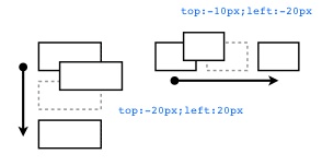
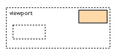
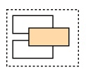
Absolute Position
- Position:
- The box is explicitly offset with respect to its containing block
- Entirely removed from the normal flow (no impact on later siblings)
- The "width" is dependent on the content if not assigned
- fixed position is relative to VIEWPOINT rather than its containing block
- "left / right / top / bottom / z-index" valid
- "left / right / top / bottom" is relative to its most recent "absolute / relative" parent
- "z-index" determines the overlapping relation, valid for "relative / absolute / fixed"
- "z-index" can be positive or negative, the latter element is on the top if equaled
static / relative /
absolute / fixed
Absolute Position
#container {position: relative;}
#block1 {background: blue; margin: 20px;}
#block2 {
  position: absolute;
  left: 100px;
  top: 100px;
  background: orange;
}
#block3 {background: green; margin: 20px;}#container {position: relative;}
#block1 {background: blue; margin: 20px;}
#block2 {
position: fixed;
right: 100px;
top: 100px;
background: orange;
}
#block3 {background: green; margin: 20px;}Absolute Position
#container {position: relative;}
#block1, #block2, #block3 {
  position: relative;
  height: 100px;
  width: 100px;
}
#block1 {
  top: 0px; z-index: 1;
}
#block2 {
  top: 25px; z-index: 999;
}
#block3 {
  top: 50px; z-index: 1;
}
<div id="container">
<div id="block1">
<div id="block2">
</div>
</div>
<div id="block3">
</div>
</div>z-index works for elements in the same level
Absolute Position
#container {position: relative;}
#block1, #block2, #block3 {
  position: relative;
  height: 100px;
  width: 100px;
}
#block1 {
  top: 0px; z-index: auto;
}
#block2 {
  top: 25px; z-index: 999;
}
#block3 {
  top: 50px; z-index: 1;
}
<div id="container">
<div id="block1">
<div id="block2">
</div>
</div>
<div id="block3">
</div>
</div>Elements with "auto" z-index keeps the same stack level with its parent (except IE 6 / 7)
NEVER MIX THEM!
- Normal Flow
- Floats
- Absolute Position
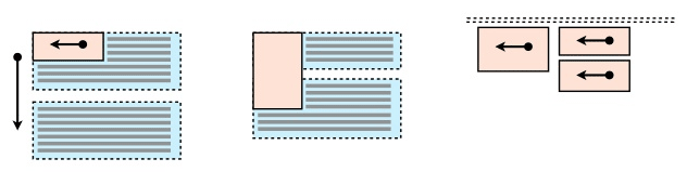
Case Study: 3 Column Design
Arrange a line chart, a bar chart, and a scatter plot in a row
Line Chart
Bar Chart
Scatter Plot
Case Study: 3 Column Design
Arrange a line chart, a bar chart, and a scatter plot in a row
Sample codes from
a project of our group:
div#left {
  display: inline-block;
  width: 40%;
  float: left;
  //...
}Case Study: 3 Column Design
<div>
  <div id="bar-chart">
  </div>
  <div id="line-chart">
  </div>
  <div id="scatter-plot">
  </div>
</div>
#bar-chart,
#line-chart,
#scatter-plot {
display: inline-block;
width: 30%;
height: 100px;
}Normal Flow
Case Study: 3 Column Design
<div>
  <div id="bar-chart">
  </div>
  <div id="line-chart">
  </div>
  <div id="scatter-plot">
  </div>
</div>
#bar-chart,
#line-chart,
#scatter-plot {
float: left;
margin-left: 10px;
width: 30%;
height: 100px;
}Floats
Case Study: 3 Column Design
<div id="container">
  <div id="bar-chart">
  </div>
  <div id="line-chart">
  </div>
  <div id="scatter-plot">
  </div>
</div>
#container {position: relative;}
#bar-chart,
#line-chart,
#scatter-plot {
position: absolute;
width: 30%;
height: 100px;
}
#bar-chart {left: 10px;}
#line-chart {left: 114px;}
#scatter-plot {left: 218px;}Absolute Position
Block Formatting Context (BFC)
Floats, absolutely positioned elements, block containers (such as inline-blocks, table-cells, and table-captions) that are not block boxes, and block boxes with ‘overflow’ other than ‘visible’ (except when that value has been propagated to the viewport) establish new block formatting contexts for their contents.
- Float:NOT none
- Overflow: NOT visible
- Display: table-cell / table caption / inline-block
- Position: NOT static / relative
IE7: hasLayout (triggered by
zoom: 1")
Block Formatting Context (BFC)
A separate "sandbox" - Benefits
- No margin collapsing
- Include float boxes when calculating height
- Do not overlap with float boxes
Block Formatting Context (BFC)
No margin collapsing
#block1,
#block2,
#block3 {
  margin: 20px;
}
#newBFC {
  overflow: hidden;
}
<div>
<div id="block1">
Block1
</div>
<div id="block2">
Block2
</div>
<div id="newBFC">
<div id="block3">
Block3
</div>
</div>
</div>Block Formatting Context (BFC)
Include float boxes when calculating height
#block2: {float: left;}
#block3: {float: right;}
<div>
<div id="block1">
<div id="block2">
Block2
</div>
<div id="block3">
Block3
</div>
</div>
</div>Block Formatting Context (BFC)
Include float boxes when calculating height
#block1: {overflow: hidden;}
#block2: {float: left;}
#block3: {float: right;}
<div>
<div id="block1">
<div id="block2">
Block2
</div>
<div id="block3">
Block3
</div>
</div>
</div>Block Formatting Context (BFC)
Do not overlap with float boxes
span {
  float: left;
  width: 120px;
  height: 120px;
  margin-left: 10px;
  background: orange;
}
#text-container {
  overflow: hidden;
}
<div>
<span>
float box
</span>
<div id="float-container">
Lorem ipsum dolo...
</div>
</div>Flexbox (CSS 3)
CSS Framework